Project Dashboard Overview
The Project Dashboard in Labelo offers a detailed view of your project's progress, performance, and key metrics, allowing you to monitor the annotation process and assess the effectiveness of both annotators and reviewers.
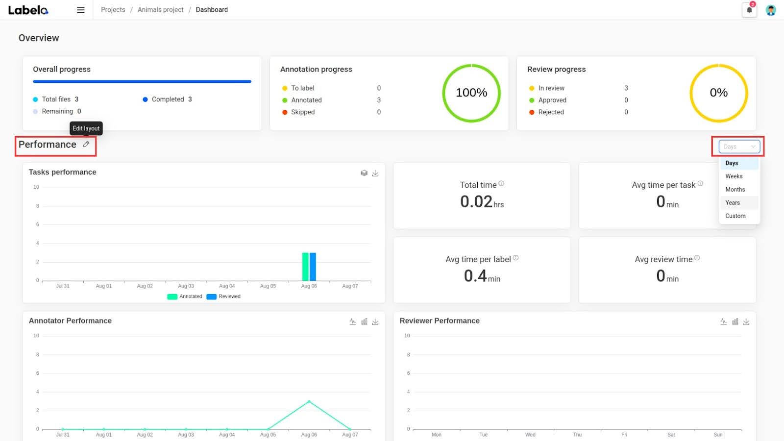
Overview
The Overview section gives you a snapshot of your project's current status:
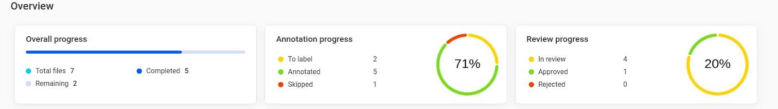
Overall Progress:
- Total Files: Shows the total number of files uploaded to the project, allowing you to gauge its scope.
- Completed: Shows the number of files that have been fully processed and annotated. This indicates how much work has been accomplished.
- Remaining: Indicates the number of files yet to be processed. This helps you gauge the remaining workload.
Annotation Progress:
- To Label: The number of tasks still pending and need to be labeled. This helps prioritize tasks that need immediate attention.
- Annotated: The number of tasks that have been successfully labeled, giving you an idea of the progress in the annotation process.
- Skipped: The number of tasks that were skipped during annotation, indicating tasks that may require further review or are not applicable.
- Completion Percentage: A visual progress bar showing the percentage of tasks that have been annotated, providing a quick snapshot of progress.
Review Progress:
- In Review: The number of tasks currently under review. This helps you monitor the review process.
- Approved: The number of tasks that have been reviewed and approved, indicating tasks that have passed quality checks.
- Rejected: The number of tasks that have been reviewed and rejected, helping you identify tasks that need rework.
- Completion Percentage: A visual progress bar showing the percentage of tasks that have been reviewed, providing a quick snapshot of review progress.
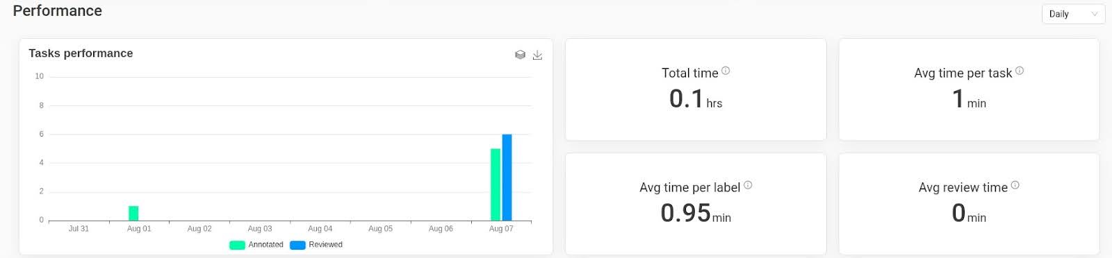
Performance
The Performance section provides detailed metrics to help you analyze the project's efficiency and effectiveness
Highlight
Take advantage of the downloadable graphs in the Performance section for presentations or reports, making it easier to communicate progress to stakeholders.
Tasks Performance:
A detailed graph illustrating task performance over time. It distinguishes between annotated and reviewed tasks. You can download this graph for further analysis or reporting purposes by clicking the download icon.
- Total Time:
- Displays the total time spent on the project, including annotation and review time, providing a comprehensive view of the effort invested in the project.
- Average Time per Task:
- Shows the average time taken to complete each task, helping you understand the efficiency of your process and identify areas for improvement.
- Average Time per Label:
- Displays the average time spent labeling each task, helping you assess the time efficiency of your annotation team.
- Average Review Time:
- Indicates the average time taken to review each task, helping you evaluate the review process and identify any potential delays.
Reminder
Keep track of the Average Time per Task and Average Review Time to identify areas for process improvement and training needs.
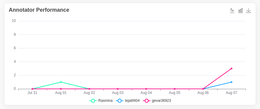
Annotator Performance:
A visual representation of individual annotators' performance over time, helping you identify top performers and those who may need additional support or training.
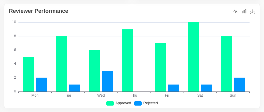
Reviewer Performance:
A visual representation of individual reviewers' performance over time, helping you assess the effectiveness of the review process and identify any potential issues.
Tip
You can toggle between line and bar charts and use the download option to export the data for further analysis.
Label Distribution Table
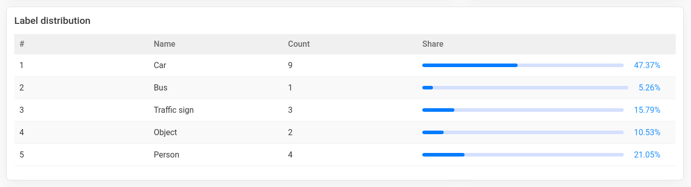
This section provides a clear overview of how different labels are distributed within a dataset.
- Name: The name of each label.
- Count: The number of occurrences of each label.
- Share: The percentage representation of each label, indicating its progress.
- The total count of labels is calculated by summing up the counts of all labels displayed in the table.
Customizing the Dashboard Layout
The dashboard layout can be customized to suit your needs:
- Click the
Edit layouticon near the heading to enable drag-and-drop functionality for rearranging the dashboard layout. - Drag and drop the sections to your preferred positions, allowing you to prioritize the most important metrics and tailor the dashboard to your workflow.
- Once you've customized the layout, a
Savebutton will appear. Click this button to save your new layout, ensuring that your changes are preserved and the dashboard remains organized the way you prefer.
Important Note
Save your customized dashboard layout after making changes to avoid losing your preferred settings during future sessions.
Filtering Data
You can filter the performance data to focus on specific time frames:
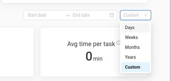
Filter by Time:
- You can filter data by different time frames: Daily, Weekly, Monthly, Yearly, or Custom (where you can set a specific date range).
- This feature helps you narrow down the data to specific periods, making it easier to analyze performance over time. For example, use the daily filter to track progress on a day-to-day basis or the yearly filter to see long-term trends.
- Custom Date Range: - Set a specific date range using
Date fromandDate tofields. This is useful for viewing data for a particular period of interest, such as a specific project phase or a promotional period.
By following this detailed overview, users will have a thorough understanding of the Project Dashboard's functionalities and how to utilize them for optimal project management.